 Over the past few months I have talked a lot about whether St Louis home prices have hit bottom yet and, in an article about 3 months ago said it appeared they bottomed out last year. When writing on the topic have stressed that, by the time we see solid proof of the bottom we will be past it and home prices will already be on the rise. Today’s pending home sales from the National Association of REALTORS (NAR) supports this notion and shows signs that increasing demand and decreasing supply is putting a damper on the rate of recovery of home sales which, NAR says, will lead to higher home prices. Yesterday it was reported that home prices in the U.S. rose 6.9 percent in the 2nd quarter (according to the Case-Shiller index) and rose over 5 percent during the same period here in St. Louis.
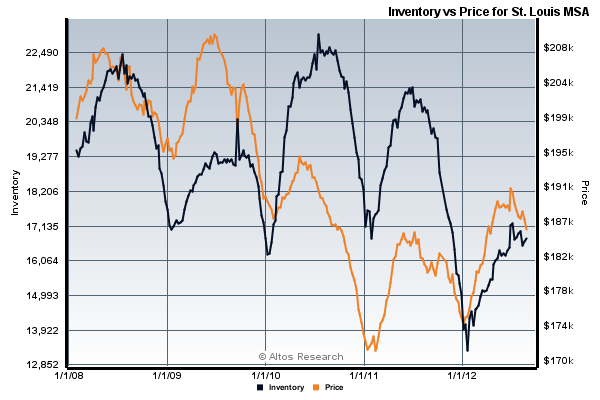
I think further proof that St Louis home prices have, in fact, bottomed out and are trending upward can be seen in the charts I prepared below based upon St Louis real estate data we publish.

The chart above shows the inventory of homes for sale (black line) as well as median home prices (orange line) for the St Louis metro area from present back over 4 years ago. As you can see, every year, home prices peak with the season, reaching their highest point during spring and summer, then fall toward the end of each year. Look at the beginning of 2011, you will see St. Louis home prices hit their lowest mark then. In late 2011, when home prices fell this time they did not fall as far, hitting a bottom of over $174,000 at year end versus about $172,000 earlier in the year. Next, we see the peak in 2012 has went higher than the 2011 peak by over $4,000. Finally, even though home prices are trending downward on the chart, you can see they are much higher than this time last year which I believe indicates the “bottom” for the year will be higher than last year and continuing trending upward. The black line represents the inventory of homes for sale and I don’t think that needs much explanation, you can see how much that has dropped. Lower inventory will lead to higher prices as well.

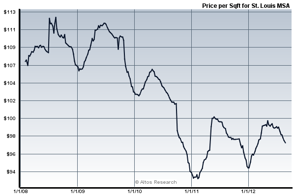
The chart above is for the same time period and shows the price per foot of homes which some economists argues is a much more accurate way to look at home prices. As we look at this chart you can see it is pretty much behaving the same as the first chart and supports the theory that St Louis home prices have indeed bottomed up and are trending upward.


Leave a Reply
You must be logged in to post a comment.