The largest price gains in home prices over the past year are found in a variety of St Louis area neighborhoods however there is a concentration of them in the 40 corridor from mid-county to west county. In compiling data for this article, I looked at what I feel is the best indicator of home price change, price per square foot, and selected neighborhoods that had at least a 10% increase in home prices during the past 12 months.
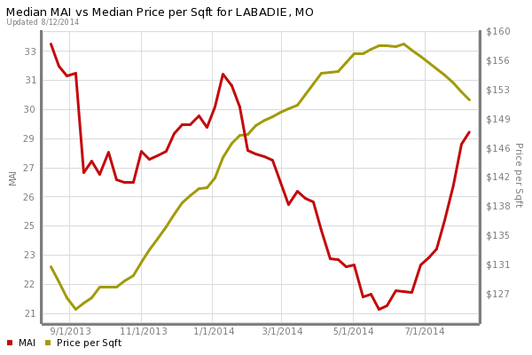
There are charts below showing the price per foot for the past year for each specific neighborhood as well as our Market Action Index (MAI) for the area as well. The MAI indicates whether a given neighborhood is a sellers market (if the index is above a 30, up to a maximum of 60) or a buyers market (below 30, down to a low of zero). As you will see, as the price changes in these neighborhoods so does the MAI, sometimes signaling that prices have went too high too quick causing the MAI to turn from a sellers market to a buyers market.
Wouldn’t you like to have an agent working for you that has access to data like this for neighborhoods throughout the St Louis metro area and can use the info to help you make a smart buying or selling decision? Please contact me and let me show you how we can help do just that.
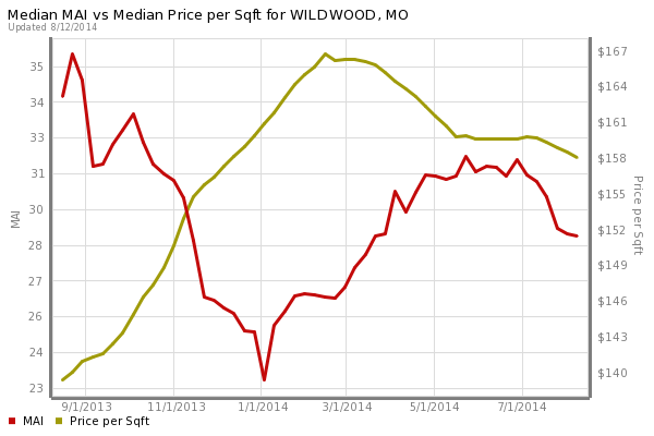
Source: MORE, REALTORES
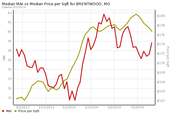
Source: MORE, REALTORS
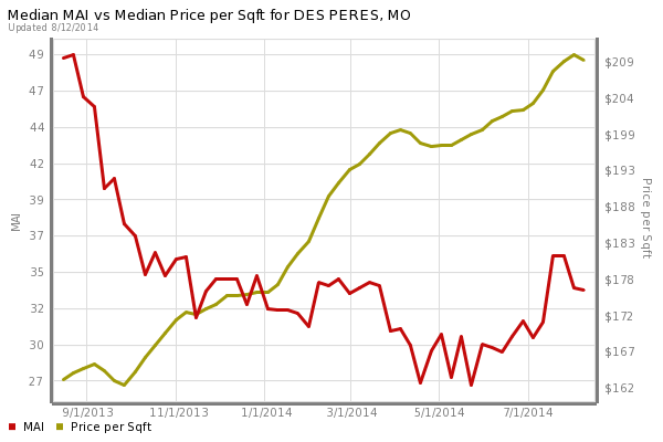
Source: MORE, REALTORES
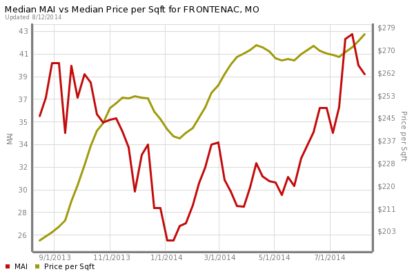
Source: MORE, REALTORES
Source: MORE, REALTORES


