This morning I watched a video from a firm that reports on the real industry and does so from a blunt, “call it as they see it”, perspective (pretty much my style too) in which they say “market correction indicators continue to roll in” and suggest that, to some extent, the party is over. This report looked at the national real estate market as a whole and specifically looked at the west coast so is not necessarily indicative of what is happening in the St Louis real estate market, however, can often be an early indicator.
As a result, I spent my early morning looking closely at the St Louis real estate market in search of market correction indicators. So, did I find indications that the St Louis real estate market is headed for a correction?
Yep. It’s called “spring is over“. :)
At about this time every year, we see a correction, of sorts due to the seasonality of the real estate business. It’s no secret that spring and early summer are always the best time for the real estate market with increased home sales and prices. As that season passes there is always a “correction” in home prices as they adjust downward for the decreased demand.
However, what I am really looking at is the “bigger picture”, is there an overall market correction taking place in St Louis or headed our way?
While it would be unrealistic to think that if a true market correction is going to be experienced by the bulk of the country that it won’t have an impact on the St Louis market, however, at this time there doesn’t appear to be any sort of serious correction imminent in the St Louis market. That’s not to say we won’t see the normal downturn in home sales and prices we expect to see due to seasonality.
Below are some charts and tables that I think are good indicators of the health of the St Louis market as well as good indicators of things to come. I’ll briefly give some comments on each as well as how I have applied the data shown to my opinion I have shared today.
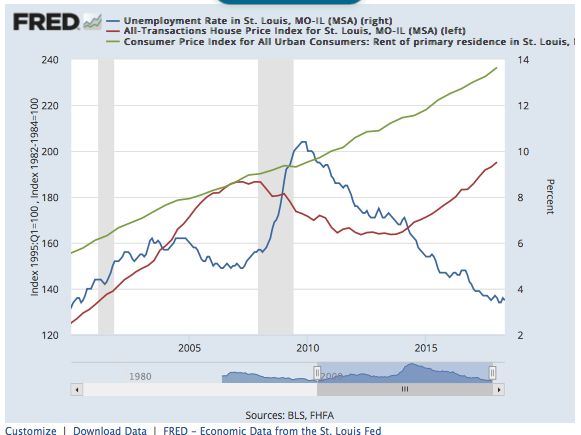
1st Chart – Aptly named, the “Housing Market Health Chart”, depicts the unemployment rate, house price index and consumer price index for rent for St Louis from 2000 to present. If you look back to when the chart begins, 2000, what a pretty healthy market looks like. Unemployment was low, below 4% and home prices and rents were increasing at about the same rate. However, if you look at 2006, around the time the market peaked and everyone was drunk on real estate, you will see unemployment had increased over 50% to 6% and that home prices were increasing much more than rents. Therefore, bad times loomed ahead and the bubble burst around 2008. Then, you will notice that the gap between home prices and rents widen significantly, and more than the historical norm, around 2011 – 2012. Hence, home prices started heading back up. Today, you can see, St Louis unemployment is very low, beneath 4% and there is still a pretty health gap between home prices and rents. Therefore, there’s nothing here that is concerning at the moment.
St Louis MSA Housing Market Health Chart
(click on the chart to see the live, interactive chart)
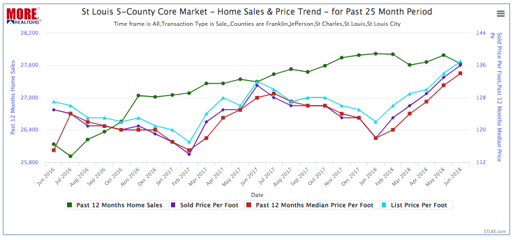
2nd Chart – A little closer look at the market than the chart above which is for all 17 counties in Missouri and Illinois that make up the St Louis MSA. The chart below is for just the 5-county core St Louis market consisting of the city of St Louis and counties of St Louis, St Charles, Jefferson and Franklin. This chart depicts some key as well which is helpful as well to gauge the market and spot trends. The green line depicts home sales for the past 12 months for each month and makes it easy to spot changing trends in home sales. As it shows, there was a slight decrease from May to June but as you look back to prior years, you will see that is normal due to seasonailty. Also depicted are the prices per square foot for homes sold during the prior 12 months as well as each month and the median price per foot of the homes listed that sold. In a nutshell, the relationship of all of these prices look fine and in line with the same time last year, so there is nothing on this chart that causes me any concern.
St Louis 5-County Core Market Home Sales & Price Trend
(click on the chart to see the live, interactive chart)

3rd Chart (Table) – This is a table that shows current listing data for the 5-county core market represented in the chart above. I created this to see how the current home prices look compared with the sold prices to see if things are in line. As the table shows, the median price per foot for homes listed is $136, which is right in line with what homes sold for last month, and just slightly over the median price of $134 per foot that homes sold for in the past 12 months. As I mentioned previously, there will need to be adjustments to the list prices on homes, but nothing more than the normal seasonal adjustments in my opinion.
St Louis 5-County Core Market On Market Listing Data
(click on the chart to see the live, interactive chart)
[xyz-ips snippet=”Seller-Resources—Listing-Targeted”]


