Lately, I’ve noticed several articles questioning whether the kind of crazy real estate market we’ve in for a while now is reminiscent of the early 2000’s which lead to a housing bubble that eventually burst in 2008. Granted, even in St Louis where we tend to not see the market extremes one way or the other like the coasts do, one could get the idea that maybe we’re headed that way with buyer’s fighting over new listings and bidding wars that have homes often selling for over the list price. However, in my humble opinion, this market is very different than the 2000 – 2007 market and we are not headed to a crash at this point.
Before I go further…my disclaimer…
I’m not an economist and I didn’t even stay at a Holiday Inn Express last night, I’m just a long-time real estate industry data junkie who has ridden the real estate roller coaster for 40+ years and have some thoughts on the current state of the market. While my comments may apply outside of our local market, my focus and commentary are on the St Louis housing market.
What’s different now from before…
[xyz-ips snippet=”Homes-For-Sale”]
For you data nerds like me, there are a lot of charts below that link to live versions or more data so you can dig in, but for the other 99.9% of the people out there, below are some bullet points highlighting a few of the more significant things I’m basing my opinion on:
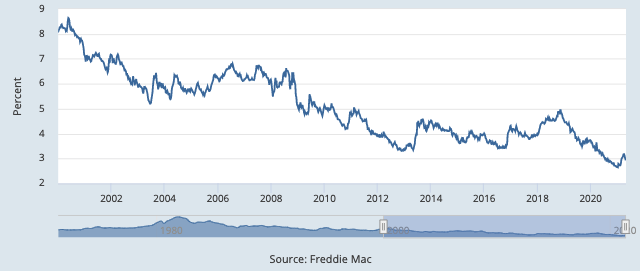
- Interest rates are less than 1/2 the rate making homes more affordable at even higher prices (Chart 1) – From 2000 through 2007 mortgage interest rates were as high as over 8% and were for most of the time at 6% or above. Interest rates now are about 3%. Here’s why this is significant:
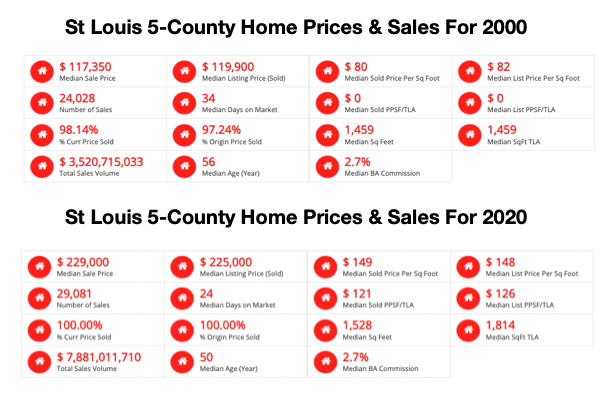
- The median price homes sold for in the St Louis 5-County core market in 2000 was $117,350. For 2020, the median sold price was $225,000, an increase of nearly 92% over 20 years. However, with mortgage interest rates of 8% in 2000 the payment on a loan for 100% of the 2000 price would have been $861 and today, at 3% the payment on the 2020 price would be $948, just $87 more, or right at 10% more. So, while prices have increased 92% the house payment for a median priced home has increased only 10% in 20 years.
- Home prices have only increase at a rate that is historically normal. (Chart 2) – As I mentioned above, the median home price in 2000 for the St Louis 5-County core market was $117,350 and in 2020 was $225,000. This increase of 92% over 20 years works out to about 4.6% per year which, if you look at historical home price appreciate it pretty much right in line with the “norm”. Granted, the last few years have seen much larger increases than that but since home prices plummeted for 4 years after the bubble burst in 2008 there was a lot of “catching up” to do. Now that we have recovered the value that was lost and are back on a normal pace, I’d expect to see the home price appreciation fall from the inflated levels we’ve seen the past few years to more normal levels soon.
- The rent to home price relationship still shows room for increased home prices. (Chart 3) – This is the chart that saved me from losing even more money than I lost in 2008. In late 2006, this chart was one of the pieces of the puzzle I put together to realize the bubble was about to burst. Even though most people buy homes to live in they are still an investment and the price must still have some reasonable relationship to what the alternative to rent a similar home would cost. For example, lets assume you are buying a $500,000 home, putting 20% down, obtaining a 3% mortgage, the property taxes are $8,000/year and the insurance is $1,500 per year. You are going to invest $100,000 cash and have a monthly payment (including taxes and insurance) of $2,477. Now, if you can rent the same home in the same neighborhood for say $2,400 you are still paying a little bit of a premium to own the home in that you have $100,000 cash in it versus a $2,400 deposit and your payment is slightly higher, but given the fact you own it and also potential appreciation you are probably ok with that. However, if that gap widens, like it di in 2006 where because of home price increases and higher interest rates say the difference was a $3,800 house payment (with $100,000 cash invested) verse $2,400 rent (with a $2,400 deposit) and it reaches the point where you may decide it’s not worth it to own and you choose to rent. That is why when this happens, either rents need to increase or home prices fall. If you look at the chart you can see rents have increased at a relatively steady rate forever and don’t fluctuate much so it’s the home prices that change. On the chart shown, you can see that normally the home price index line (blue) is below the rent index line (red) by a fairly consistent space. However, in 2004 you can see prices rent up to the point that the home price line went above rents (which was a red flag for me that home prices would fall) and sure enough home prices fell. You can see now even with the home price increases the gap between the two indexes is larger than the historical norm leaving room for home prices to increase further without raising a red flag.
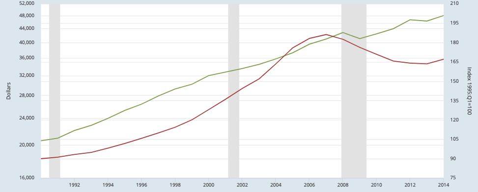
- The income to home price relationship still shows room for increased home prices. (Chart 4) – Just like the chart above, if you look at the relationship between income of people in St Louis and St Louis home prices you will see the normal gap between the two and then what happened in 2004 – 2007. When you look at the current period you see the gap is still wider than the historical norm once again leaving room for home price increases.
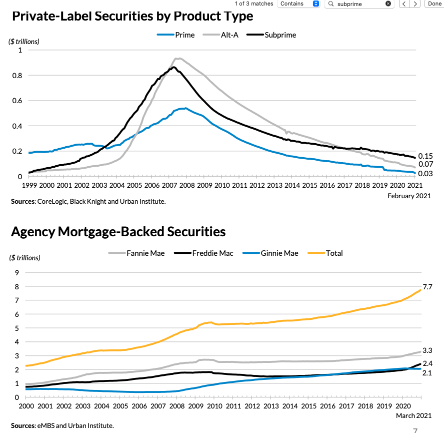
- It’s an “honest” market (chart 5) – One problem that helped lead to the housing bubble before was the advent of “subprime” loans as well clever things like “no doc” loans, “stated income” loans and the like. As the chart shows, subprime loans went from almost non-existence in 1999 to nearly a trillion dollar market in 2007 and Alt-A loans (better than subprime but still pretty risky mortgages) did the same. The availability of financing to people that wouldn’t have qualified under normal, more sound guidelines led to artificially inflated prices, an artificially high rate of sales and unfortunately, a lot of loan fraud. As the chart shows, now these types of loans are at greatly reduced levels and at a volume that is consistent with a historic norm. The second chart shows that the loan volume to Government Sponsored Enterprise (Fannie Mae, Freddie Mac and Ginna Mae) which are traditional conventional mortgages, has doubled since 2006. This means that the current market is being driven largely by well-qualified purchasers using traditional mortgage products making the resulting home prices a much more accurate reflection of the true market.
So for the reasons stated above, I feel that the market we are in now is inherintly different then in the mid-2000’s and, while we may see a cooling off of home price appreciation rates in the near future back to historic normal year over year levels, there’s nothing I see in any of the data that resembles the market that led to the bubble bursting before. So I don’t see any chance of a “housing bubble” followed by a “housing bubble burst” like before. One caveat…there are external factors that could change the housing market dramatically and quickly such as major shifts in the economy, unemployment, International relations, etc but absent something like that I think we’re good for now.
Mortgage Interest Rates – 2000-Present- 30 Year Fixed Rate (chart 1)
(click on chart for live interactive chart as well as more mortgage rate charts)
St Louis 5-County Core Market Home Prices For 2000 and 2020 (chart 2)
St Louis Home Price Index Vs. CPI Index For Urban Consumer Rent (chart 3)
(click on chart for live interactive chart)
St Louis Home Prices Vs. St Louis Per Capita Personal Income (chart 4)
(click on chart for live interactive chart)
Mortgage Loans 1999-Present (chart 5)
[xyz-ips snippet=”Homes-For-Sale”]
