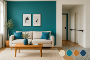
Color isn’t just “pretty.” Thoughtfully used, it can lift mood, energize a room, calm a busy mind, and even make homes easier to navigate. Decades of research show that color influences how we feel, think, and behave. The secret is intentional, balanced use—often a confident accent paired with clear contrast.
Why color changes how we feel
Two simple qualities, brightness and saturation predict much of our emotional response to color. Brighter, more saturated hues tend to feel more positive and energizing, while dimmer, grayer versions dampen that response. This pattern has been replicated repeatedly across laboratory and real‑world settings (see sources).
There’s also a comfort “sweet spot.” Studies comparing interior color schemes suggest extremely dull spaces can under‑stimulate while overly intense palettes can overwhelm. Moderate, intentional color often supports alertness and comfort best.
A note for seniors (and why all‑cream can fall flat)
As we age, subtle color differences get harder to perceive and low‑contrast rooms can feel washed out. Evidence based design for aging and dementia care recommends using color and especially contrast to support mood, orientation, and independence. All‑neutral, low‑contrast spaces can be visually monotonous; a single accent wall or colorful focal point brings back interest and lift without overwhelming the space.
What common colors often communicate
Associations vary by culture and memory, but these cues are widely observed:
- Red — energy and urgency; best as a small pop.
- Orange — sociable and welcoming; warms gathering spaces.
- Yellow — optimism; try muted, sun‑kissed tones.
- Green — renewal and balance; biophilic and easy on the eyes.
- Blue — calm and clarity; terrific for bedrooms and studies.
- Neutrals — timeless when paired with contrast and a confident accent.
Colorful places, instant lift (Mediterranean & Caribbean blues)
It’s no accident that beloved destinations wear bold blues and sun‑washed color. Research links viewing blue and green spaces (sea, sky, nature) with lower stress and better mood. Across the Mediterranean and Caribbean, color is part of place identity: Willemstad, Curaçao (a UNESCO site) is famed for vivid facades in reds, blues, ochres, and greens; Burano in the Venetian Lagoon wears cheerful, high‑visibility hues, traditionally explained by fishermen finding home through fog; and Chefchaouen, Morocco, the “Blue City,” features layered blues often linked to Sephardic Jewish traditions of sky‑blue symbolism. Design‑wise, these palettes pair soothing sea‑and‑sky hues with warm accents—an engaging, photo‑friendly balance you can echo at home with a single accent wall or colored focal piece.
Practical palettes by room
Living & Dining (gathering zones): Choose warm, mid‑saturation hues (terracotta, soft coral, olive, marigold) as accents. Pair with creamy neutrals and natural textures. Keep one clear focal wall or element so photos feel compelling, not busy.
Kitchens: Colored island bases (ink blue, eucalyptus green) or a soft‑hued backsplash add personality while keeping cabinets neutral. Mind undertones so counters, floors, and walls harmonize.
Bedrooms & Studies: Softer blues and greens promote calm; dial saturation to medium or low. Use contrast at headboard/wall and drapery/trim for definition.
Entries & Halls: Create wayfinding with contrast: lighter walls, slightly deeper doors/handrails, and defined floor transitions—especially helpful for older eyes.
How to use color with confidence (at home or for selling)
- Choose a hero, not a rainbow. Pick one accent wall or one large colored element (island base, headboard wall, big art piece) for impact without clutter.
- Pair color with contrast. Ensure doors, railings, counters, and floor transitions don’t blend together—contrast helps visibility, wayfinding, and photos.
- Mind the light. The same paint shifts from morning to evening; test large swatches on two walls and live with them for 48 hours.
- Warm where we gather; cool where we rest. Use energetic, mid‑saturation warms in social zones and calmer greens/blues in bedrooms and reading nooks.
- Let listing photos sing. A confident accent plus styled neutrals photographs more “alive” than all‑beige everything.
Mini Case Study: One Weekend, One Wall
Before: entry and living room read flat in photos (all creamy neutrals, low contrast). After: we repainted one living‑room wall a softened eucalyptus, swapped two pillows, added a wood tray vignette, and framed neutral art with black trim for contrast. Result: photos popped, online saves doubled, and showings increased the following weekend, no “rainbow,” just a confident accent with clear contrast.
The bottom line
Color isn’t about being daring for daring’s sake. It’s about crafting environments that feel good to live in, energizing the right moments, soothing the others, and helping every age navigate home with confidence. Evidence suggests that measured, intentional color can support positive mood and day‑to‑day function, while an all‑neutral, low‑contrast world often under‑stimulates.
So go ahead, pick a hue that makes your heart lift, ground it with great lighting and contrast, and let your space smile back at you.
Work with a Realtor® who has a vision for decorating and staging homes. If you’re a seller, I can use my knowledge and experience to help you do the right tweaks to your home to guarantee your home shows it’s best. If you are a buyer, I can help you see the potential in a listing that may not be obvious or apparent.
Lisa Garza
STLLisa.com
Lisa.Garza@STLRE.com
314.924.5472
Sources (plain‑English highlights)
- Elliot, A. J. (2015). Color and psychological functioning: a review. Frontiers in Psychology / Annual Review of Psychology.
- Valdez, P., & Mehrabian, A. (1994). Effects of color on emotions. Journal of Experimental Psychology: General.
- Küller, R., Mikellides, B., & Janssens, J. (2009). Color, arousal, and performance. Color Research & Application.
- Tofle, R. B., et al. (2004). Color in Healthcare Environments. The Center for Health Design.
- Ulrich, R. S. (1984). View through a window may influence recovery from surgery. Science.
- White, M. P., et al. (2020). Blue space, health and well‑being: narrative overview. Environmental Research.
- Wiener, J. M., & Pazzaglia, F. (2021). Ageing‑ and dementia‑friendly design. Frontiers in Psychology.
- UNESCO World Heritage Centre. Historic Area of Willemstad, Curaçao. (for the color tradition)
- Isola di Burano (official site). Legends about Burano’s colorful houses. (for the fog/fishermen story)
- AFAR Magazine. Why is Chefchaouen, Morocco, painted blue? (overview of theories)
Comments are closed.


