“How’s the market?”
It’s one of the most common questions I get from buyers and sellers.
It’s also one of the hardest questions to answer honestly.
Not because the data isn’t available. In fact, we have more market data available today than ever before. The challenge is that different statistics, different timeframes, and different geographic areas can all tell very different stories about the same market.
That’s why two people can look at real estate data and come away with completely different conclusions.
And surprisingly, both of them may be right.
Three Charts. Three Stories.
Let’s start with home sales in the St. Louis metropolitan area.
The charts below all track the same market using the same underlying data. The only thing that changes is the timeframe being displayed.
Same market. Same data. Three different stories.
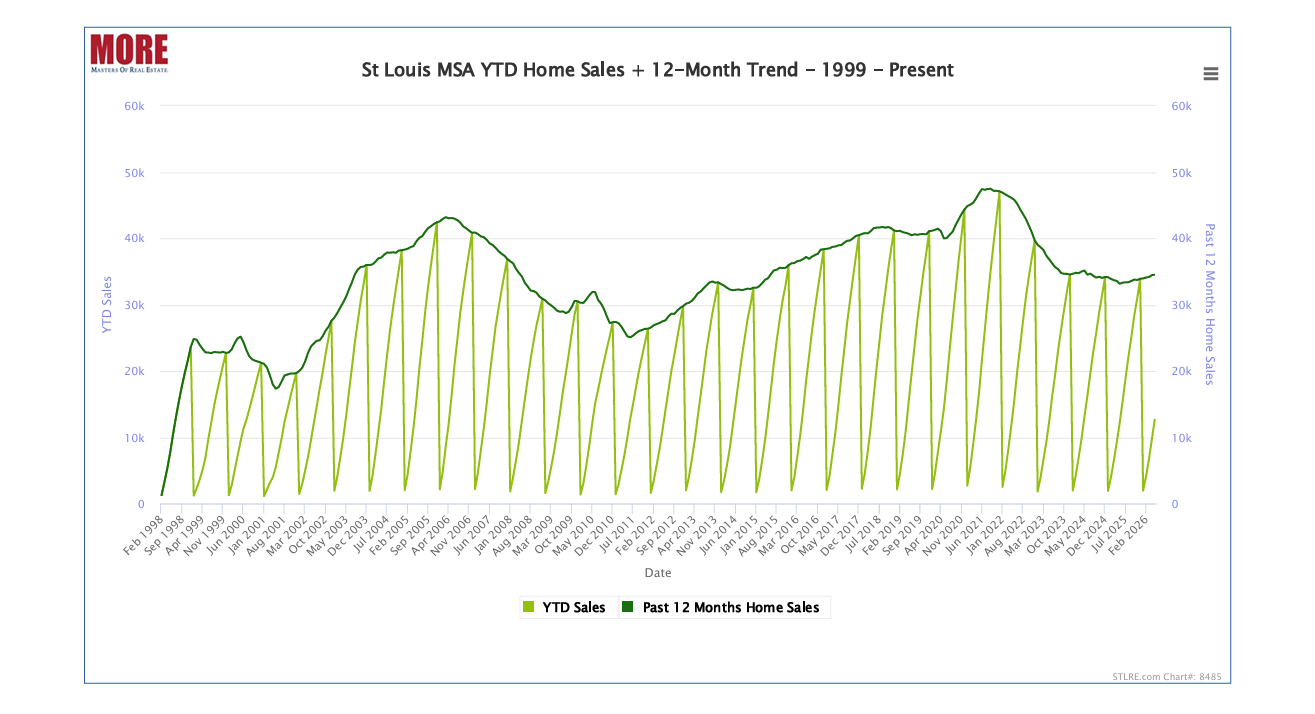
A long-term view shows a market that has experienced multiple cycles, including the housing crash, recovery, pandemic surge, and recent normalization. From this perspective, today’s market appears relatively resilient.
If this were the only chart you saw, you might conclude the market is relatively healthy. Looking across a quarter century of data, that’s a reasonable takeaway.
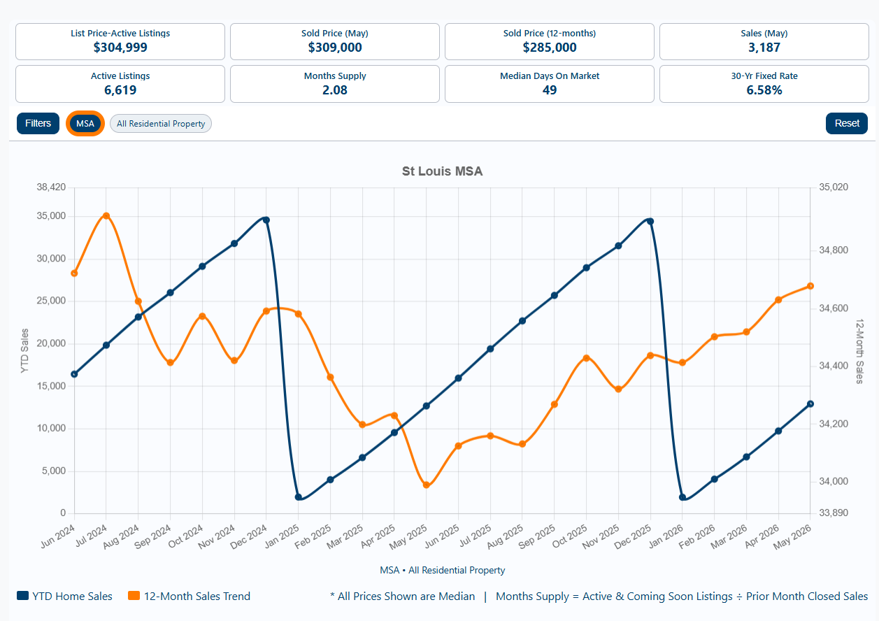
Narrow the timeframe to the last two years and a different story emerges. Compared to the pandemic-era highs, home sales appear to be softening.
Now the conversation changes. Instead of focusing on long-term resilience, attention shifts toward moderation and declining activity compared to the unusually active pandemic years.
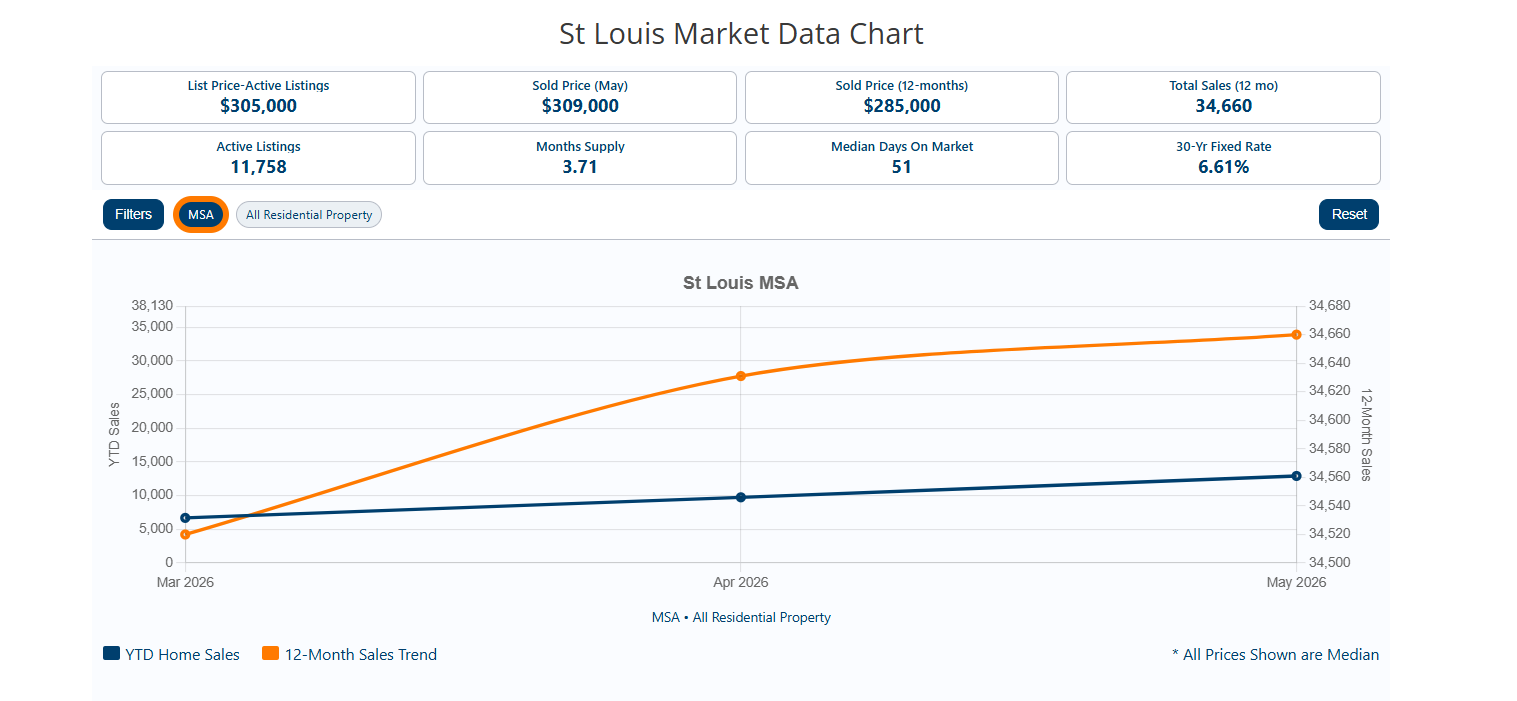
Zoom in again and the story changes once more. Recent sales activity is increasing as the spring market gains momentum.
Viewed through an even narrower lens, the market appears to be gaining strength.
So which chart is right?
All of them.
Each chart answers a different question. A three-month chart tells us what’s happening now. A two-year chart helps identify recent trends. A 25-year chart provides perspective. None is wrong, but none tells the whole story.
The Challenge Isn’t Accuracy. It’s Context.
The same thing happens when we look at contract activity.
Depending on the timeframe selected, I can accurately tell you that contracts are up 20%, up 14%, or up 4%.
All three statements can be true at the same time because they’re measuring different periods.
The challenge isn’t accuracy. It’s context.
Consumers see a headline, hear a percentage, and often assume they’re looking at the complete picture when they’re really seeing only one piece of it.
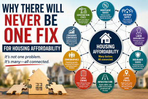
The Bigger Problem: There Is No Single St. Louis Market
Even if everyone agrees on the timeframe, another challenge remains.
When people talk about “the St. Louis housing market,” they’re often describing something that doesn’t really exist.
The St. Louis metropolitan area contains hundreds of municipalities, thousands of neighborhoods, and countless property types competing for different buyers.
A buyer looking for a condo in Creve Coeur is participating in a different market than a buyer shopping for a four-bedroom home in Kirkwood. A seller in St. Peters may be experiencing conditions that look very different from a seller in Webster Groves.
Luxury homes, starter homes, condos, villas, new construction homes, and century homes often behave differently even when they’re located in the same municipality.
One reason real estate conversations can become so frustrating is that people are often talking about different markets without realizing it. A first-time buyer shopping in the $250,000 range, a move-up buyer searching between $500,000 and $700,000, and an investor evaluating rental property may all be reacting to entirely different conditions while using the same phrase:
“The market.”
That’s why broad market headlines often feel disconnected from what individual buyers and sellers are actually experiencing.
The Closer You Get, The Better the Data Becomes
National housing statistics can be interesting. St. Louis statistics are more useful. Municipal-level statistics are better still, and neighborhood or subdivision-level data is often where the real story begins.
The closer we get to the specific property type, location, and buyer pool, the more relevant the information becomes.
One advantage of having access to years of archived market data is the ability to look beyond the standard monthly snapshots most consumers see.
At MORE, REALTORS®, we use that historical perspective to answer an important question:
Is what we’re seeing unusual, or has this happened before?
A single month of data can tell you what’s happening. Historical data can help tell you whether it matters.
So… How’s the Market?
The honest answer is:
It depends.
Not because anyone is trying to avoid the question, but because the answer genuinely depends on what you’re measuring.
The market may be improving on one chart, softening on another, and behaving normally on a third.
One municipality may be outperforming the broader region. One subdivision may be seeing multiple offers while a nearby neighborhood experiences price reductions. A particular property type may be thriving while another struggles.
All of those things can be true at the same time.
That’s why the most useful market analysis doesn’t start with a headline or a single chart. It starts with understanding the specific market you’re actually participating in.
The next time you hear someone confidently declare that the market is booming, crashing, hot, cold, or stagnant, ask one simple question:
According to which chart?
Then ask another:
Is that the chart that matters to me?

Karen Moeller
STLKaren.com
Karen.McNeill@STLRE.com
314.678.7866
About the Author:
Karen Moeller is a St. Louis area REALTOR® with MORE, REALTORS® and a regular contributor to St. Louis Real Estate News, helping clients make informed, data-driven decisions.