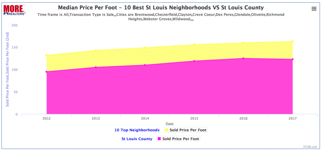
Yesterday, I did a post on the 10 St Louis neighborhoods that made it in the Niche list of “100 Best Places to Live In America”. This prompted a question as to how much better price appreciation have home owners seen in these neighborhoods as a result of the features they have that make them the “best places to live” verses the normal appreciation for the area? Since it just so happens that all ten of the neighborhoods that made the list are in St Louis county, I decided to pull a chart to compare the median price per foot (the most accurate way to compare home prices) of homes sold in the top ten neighborhoods versus St Louis County as a whole. As the chart below illustrates, here is what I found when I looked at home prices from January 1, 2012 (around the bottom of the market after the housing bubble burst in 2008) through the end of 2016:
- St Louis County saw home prices increase 29.5% during this period, from $95/foot in 2012 to $123/foot in 2016.
- The 10 neighborhoods included in the Best Places To Live list saw home prices increase 23.5% from $132/foot in 2012 to $163/foot in 2016
Hmm…so the best neighborhoods saw home prices increase at a lower rate than that county they are located in? What does this mean? I don’t know….could be the fact the median price in the better neighborhoods is roughly 50% higher to begin with so the higher priced homes may appreciate slower….or, it could be that part of what makes these neighborhoods the “best” is they offer good value so the fact that home price appreciation has been lower could be what put them on the list. Whatever the reason, it’s just a good ice breaker for a Saturday morning. :)
Search St Louis Homes For Sale HERE
See ALL Homes That Will Be Open In St Louis This Weekend
Find The Value Of Your Home In Under A Minute!


